West Cork Arts Centre
2008, Cork, Ireland
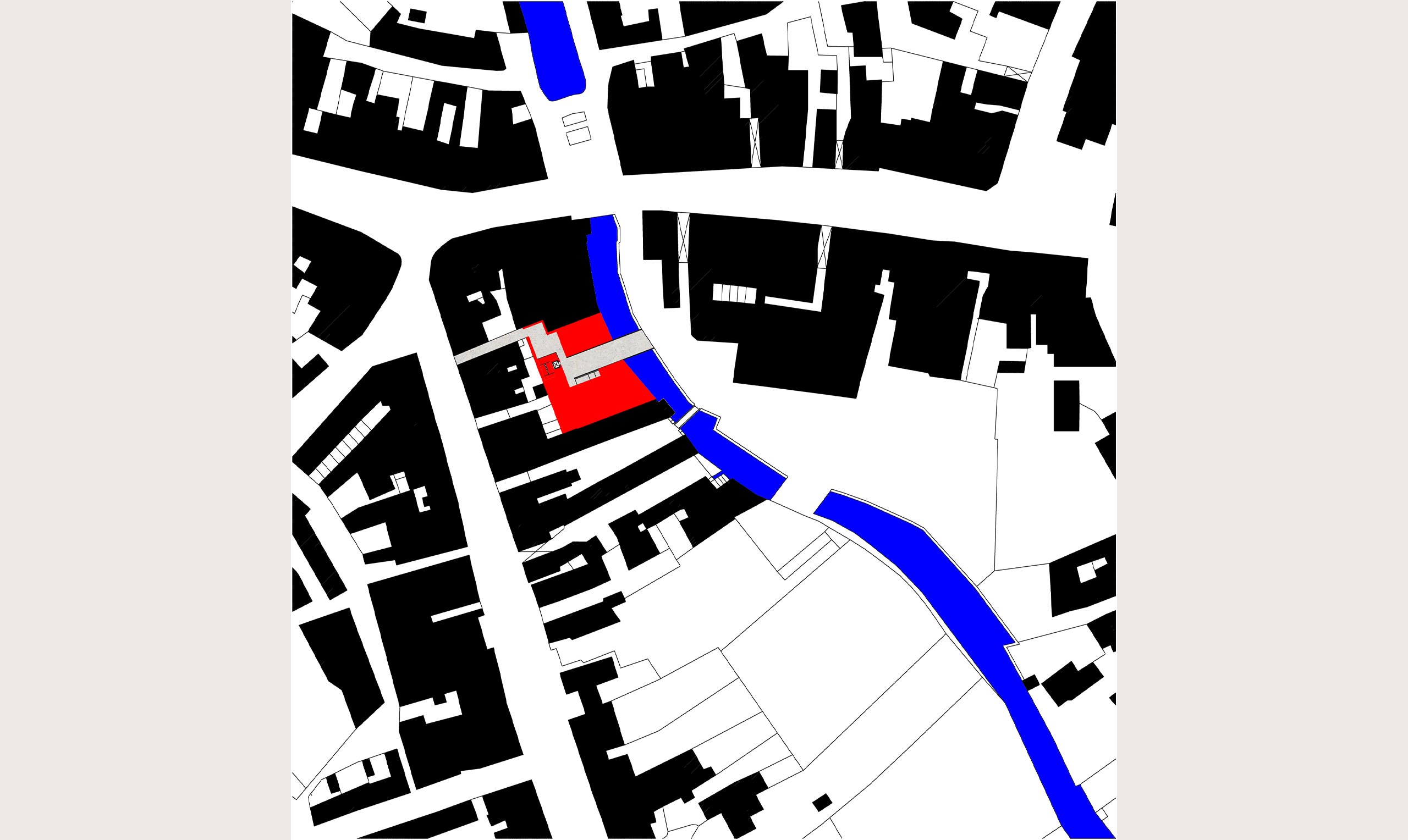
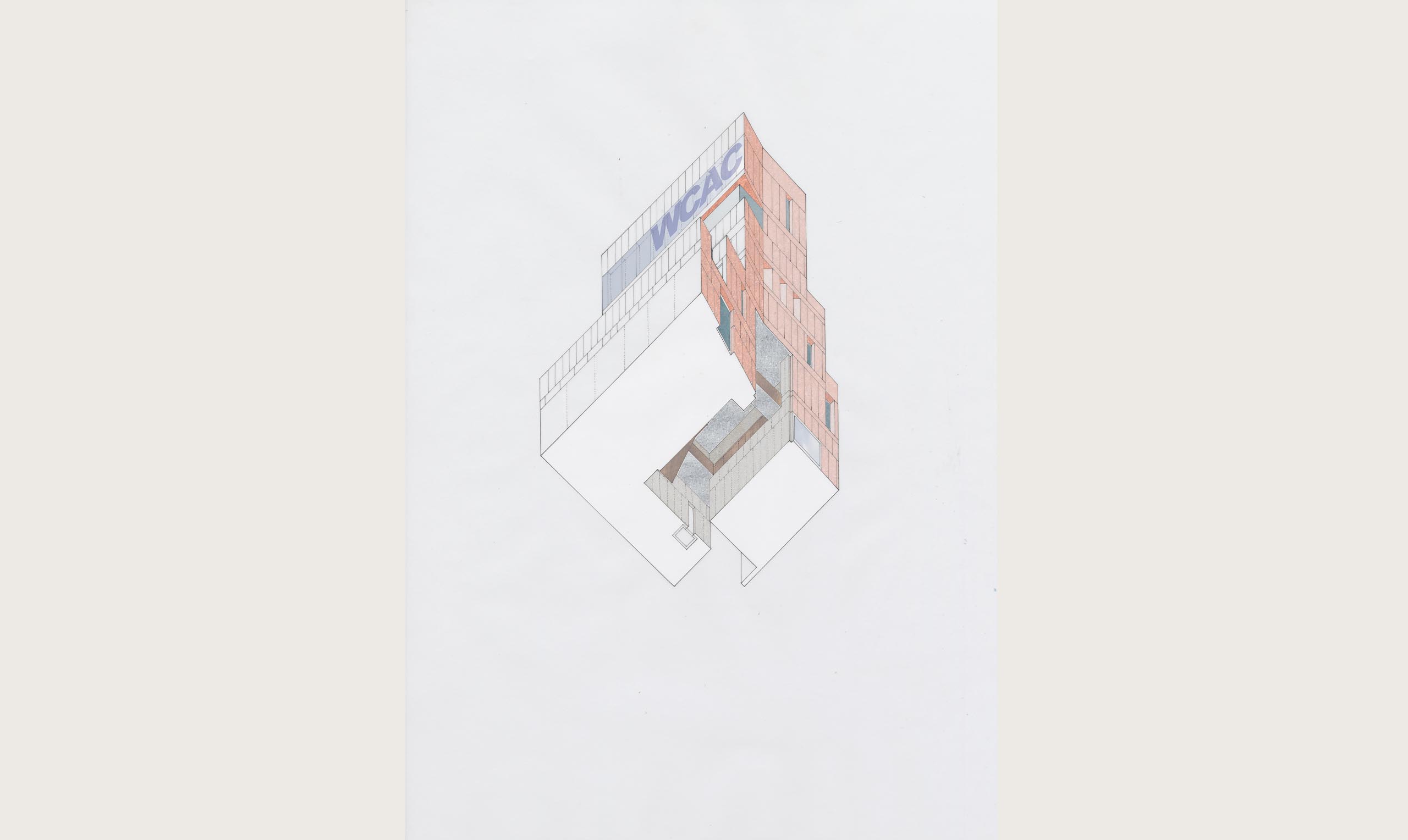
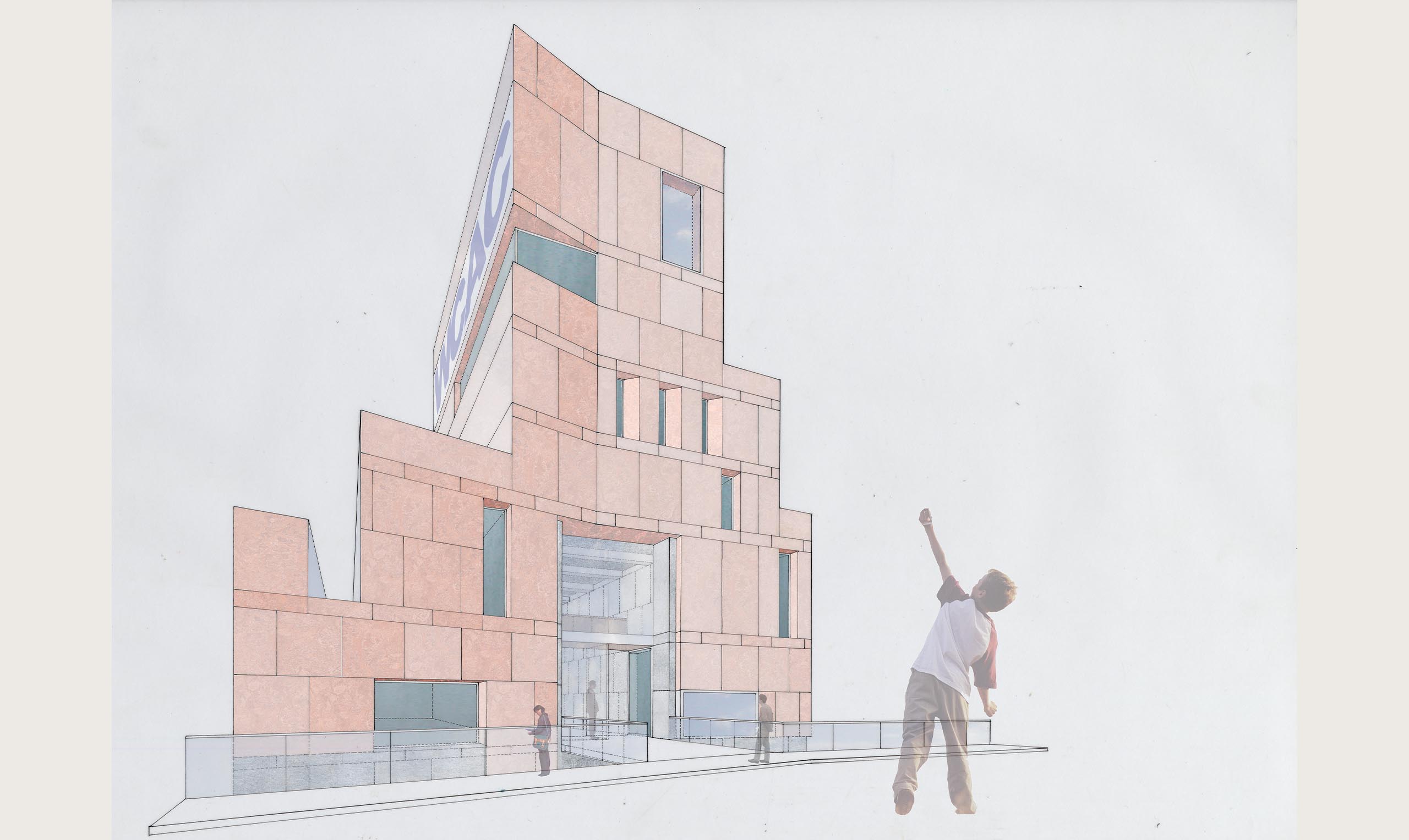
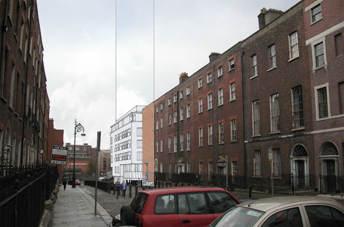
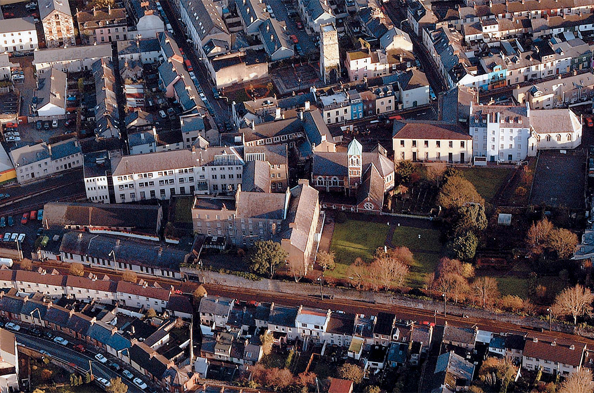
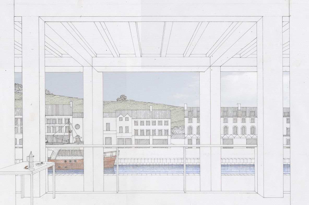
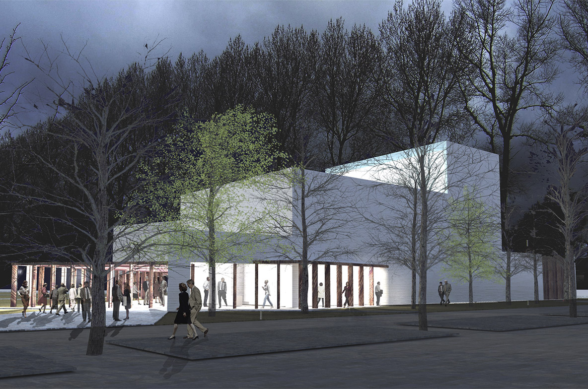
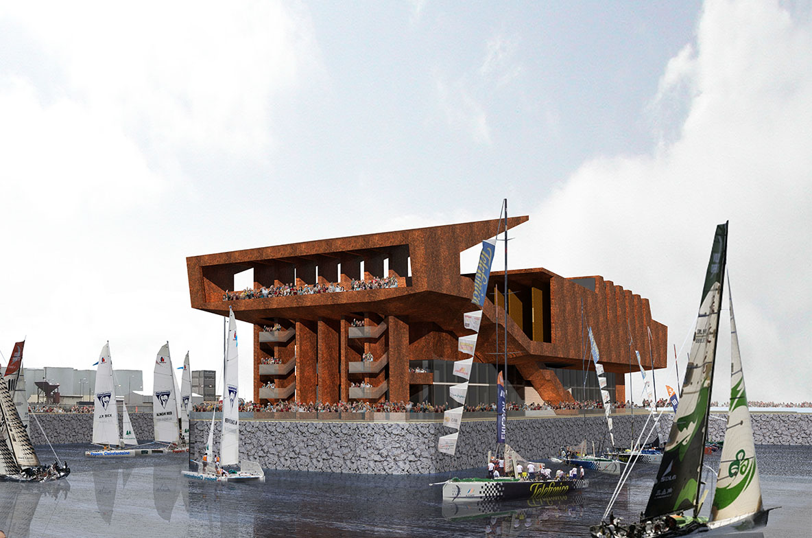
The site, carved out of the intricate arrangement of lanes and alleyways in the heart of Skibbereen, suggests a proposal which uses the response to context as a primary design generator. The need to respond creatively to the particular and intimate setting in the interstices of the town is in tune with the clients requirements to make space for art in the community, while creating a significant landmark that will attract new users and visitors.
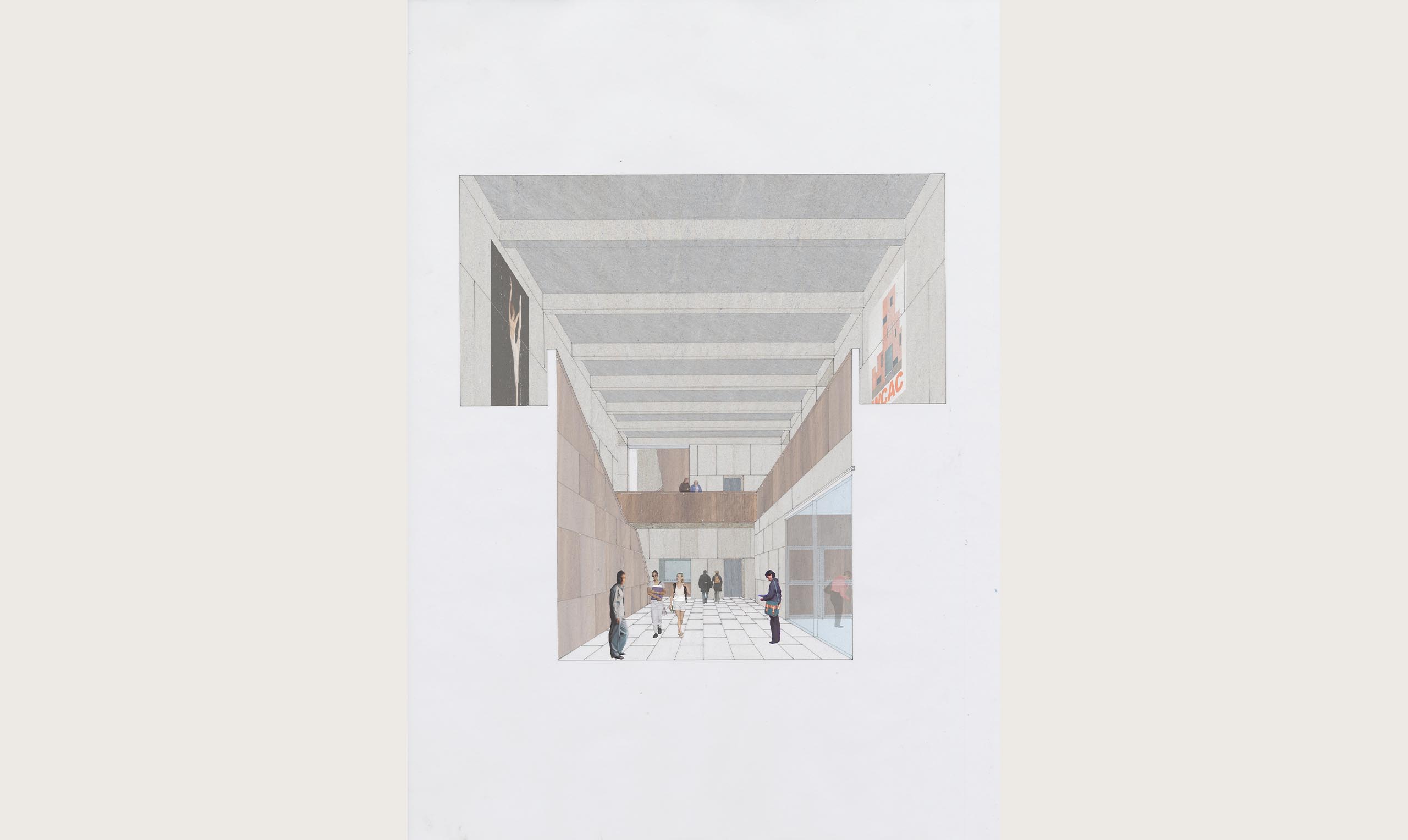
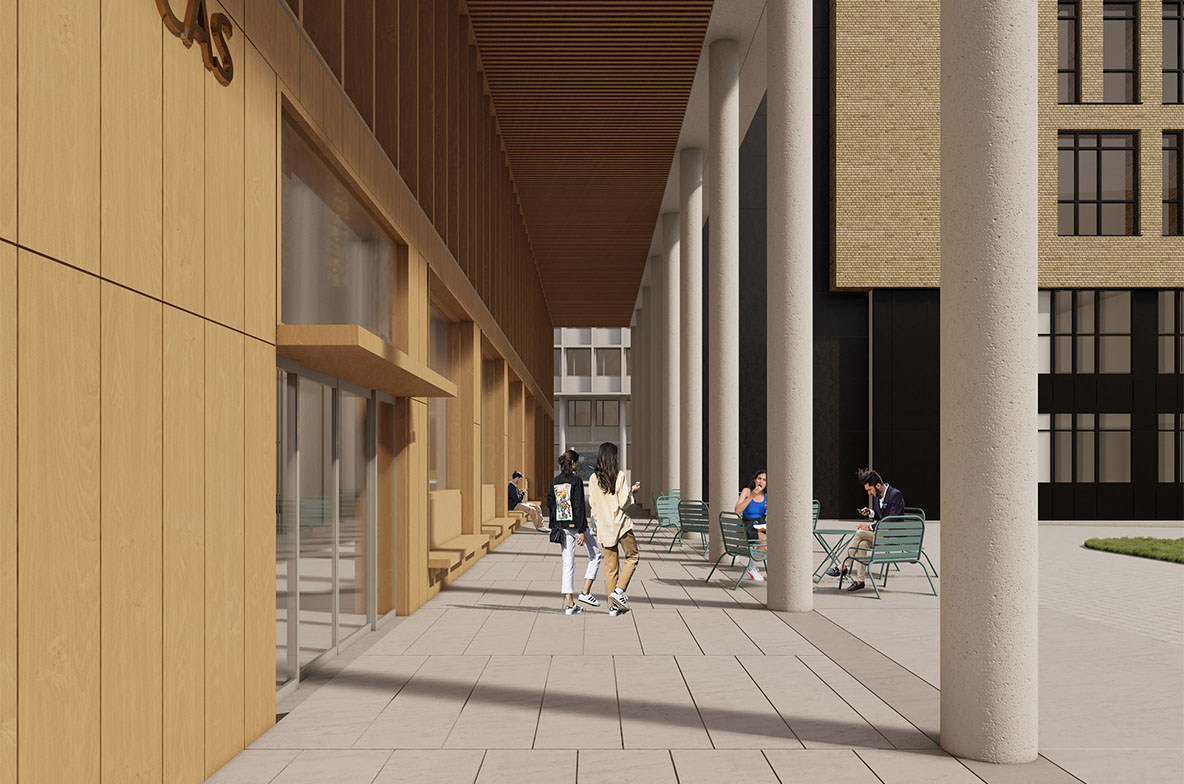
We have proposed a passage, chiselled out of the urban block, linking Townshend Street across the Caol Stream to the car park. This is a public route, unified by stone flags that continue across the stream, and lit at night by tiny fibre optic lens set in the stone.
Continue Reading
+
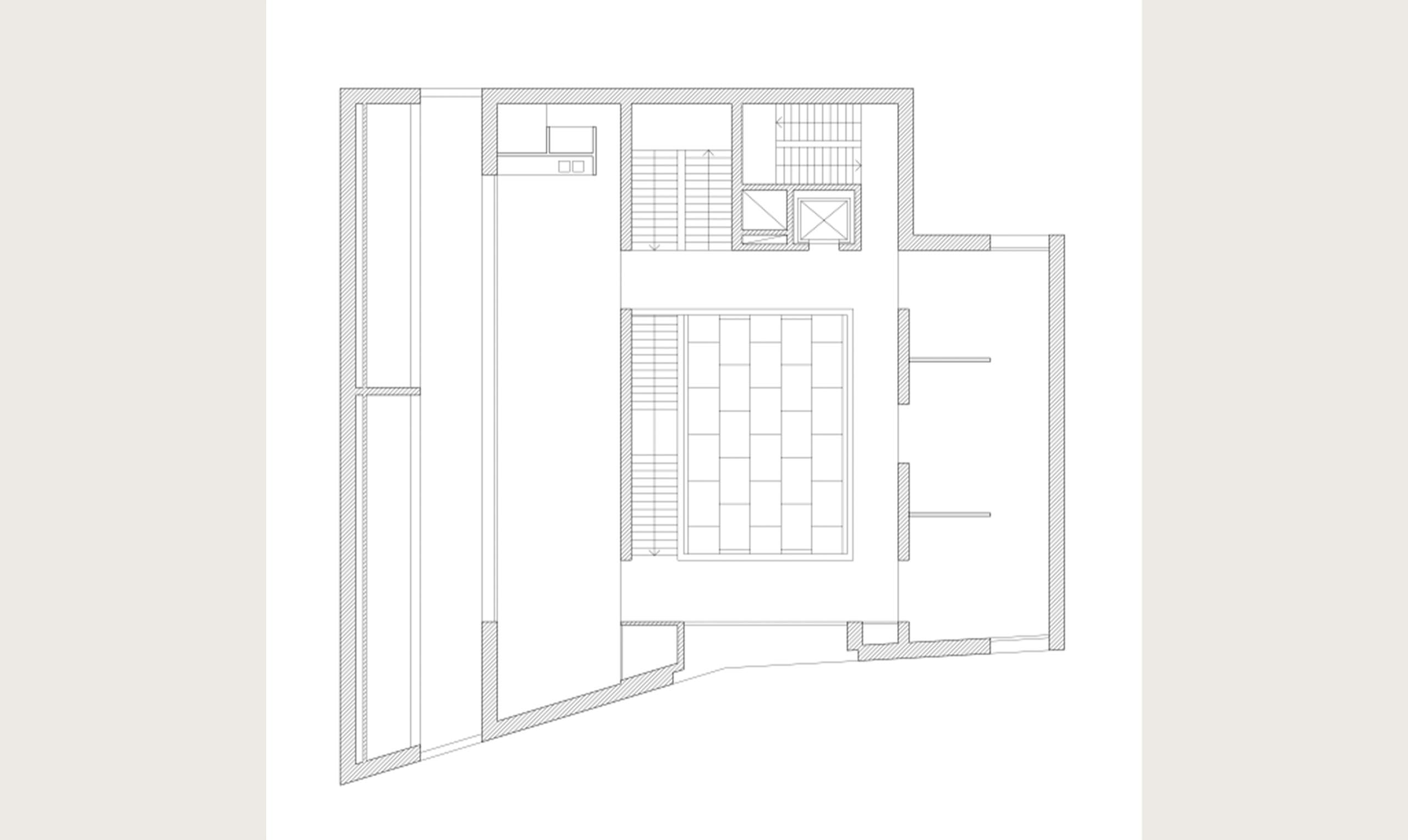
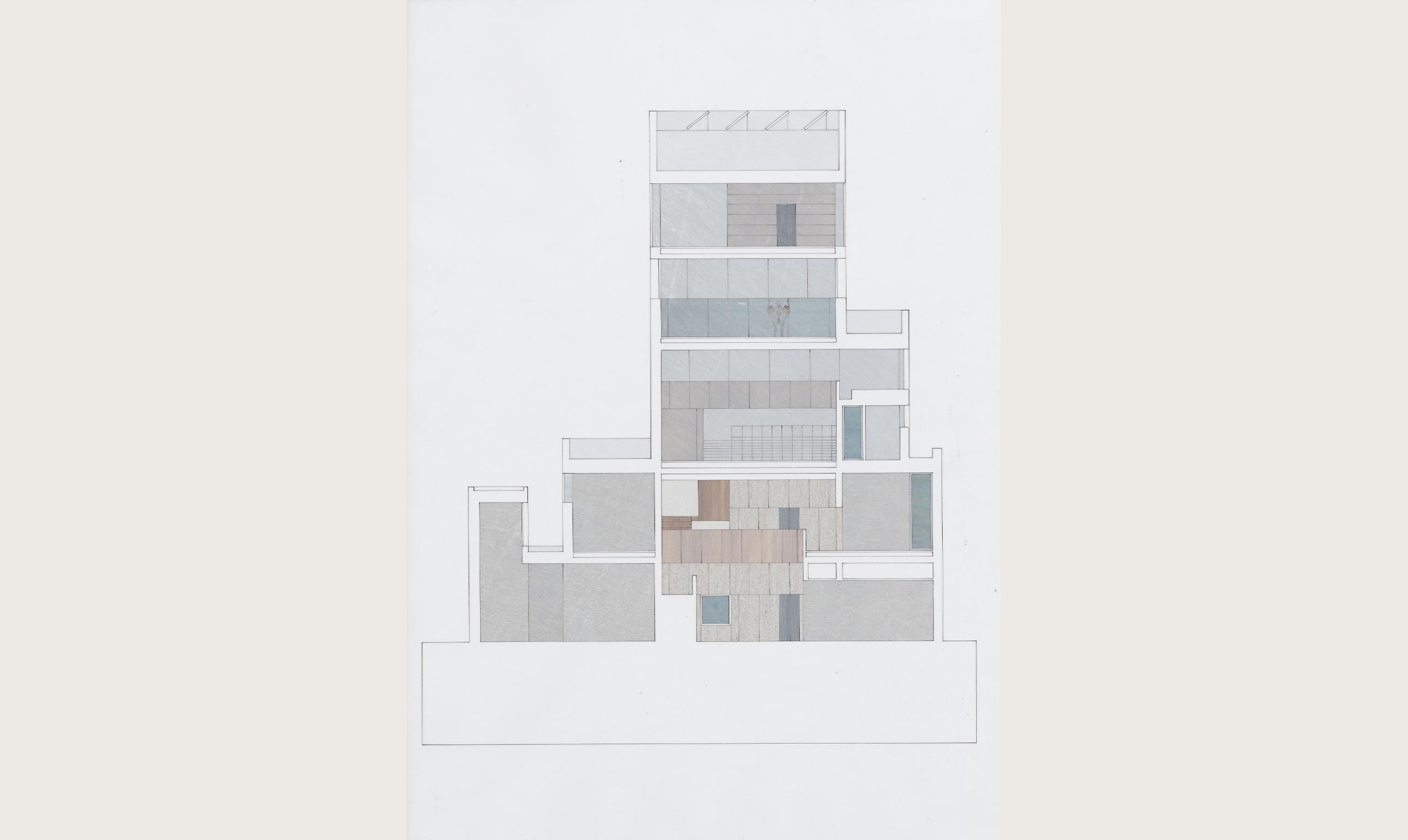
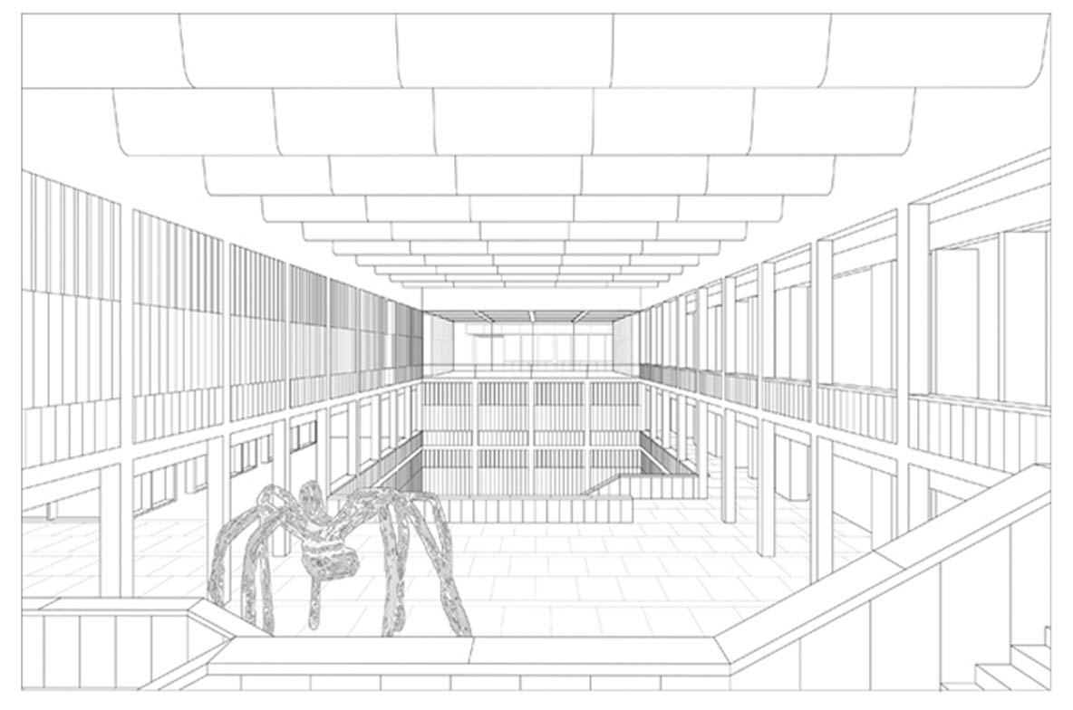
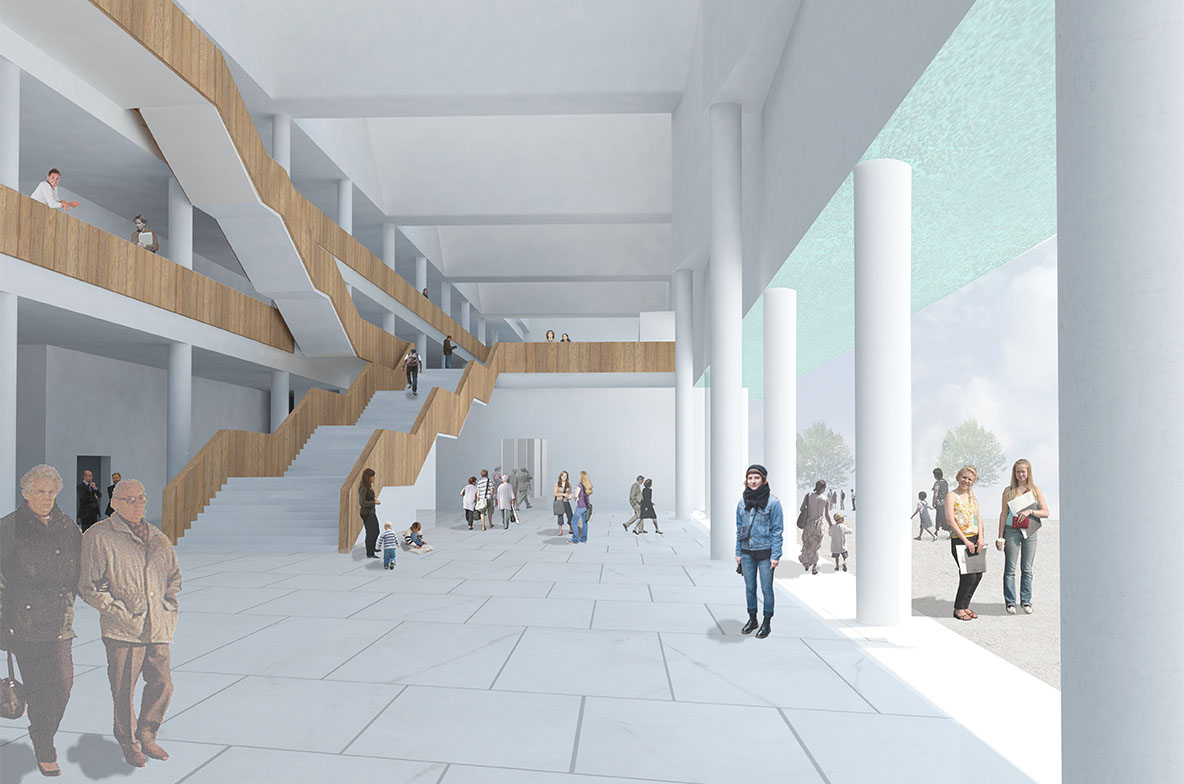
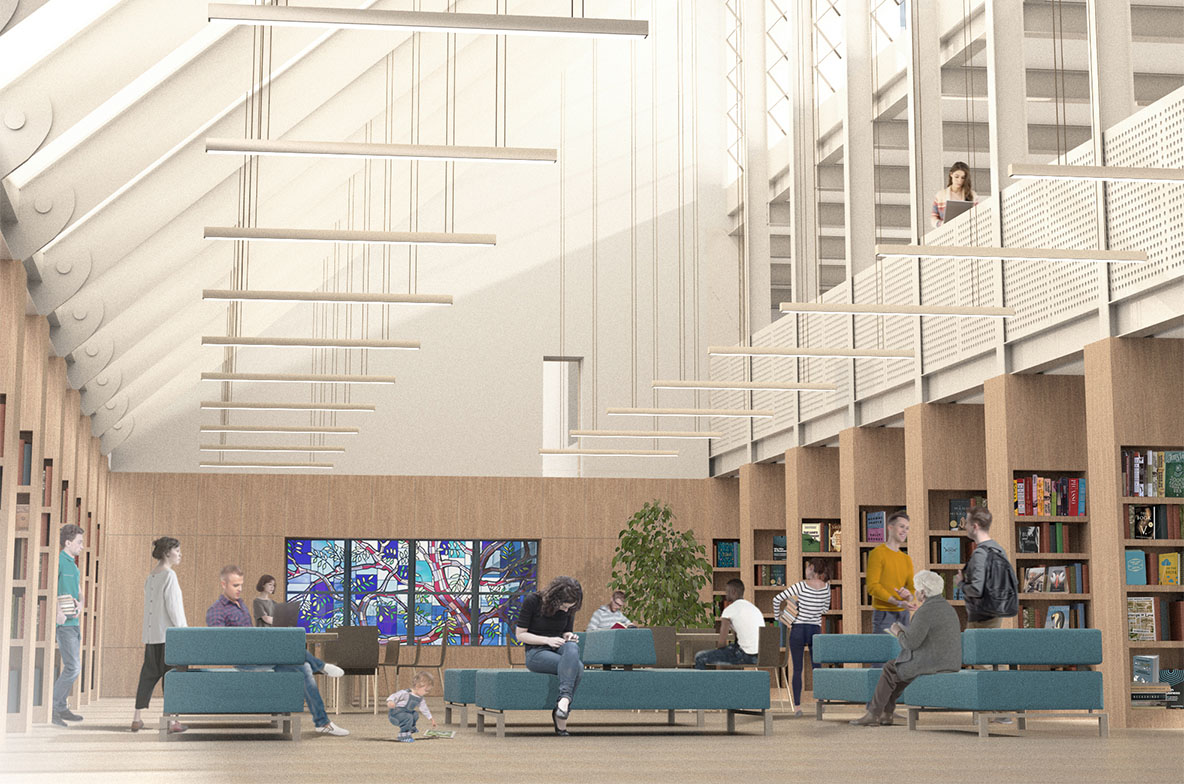
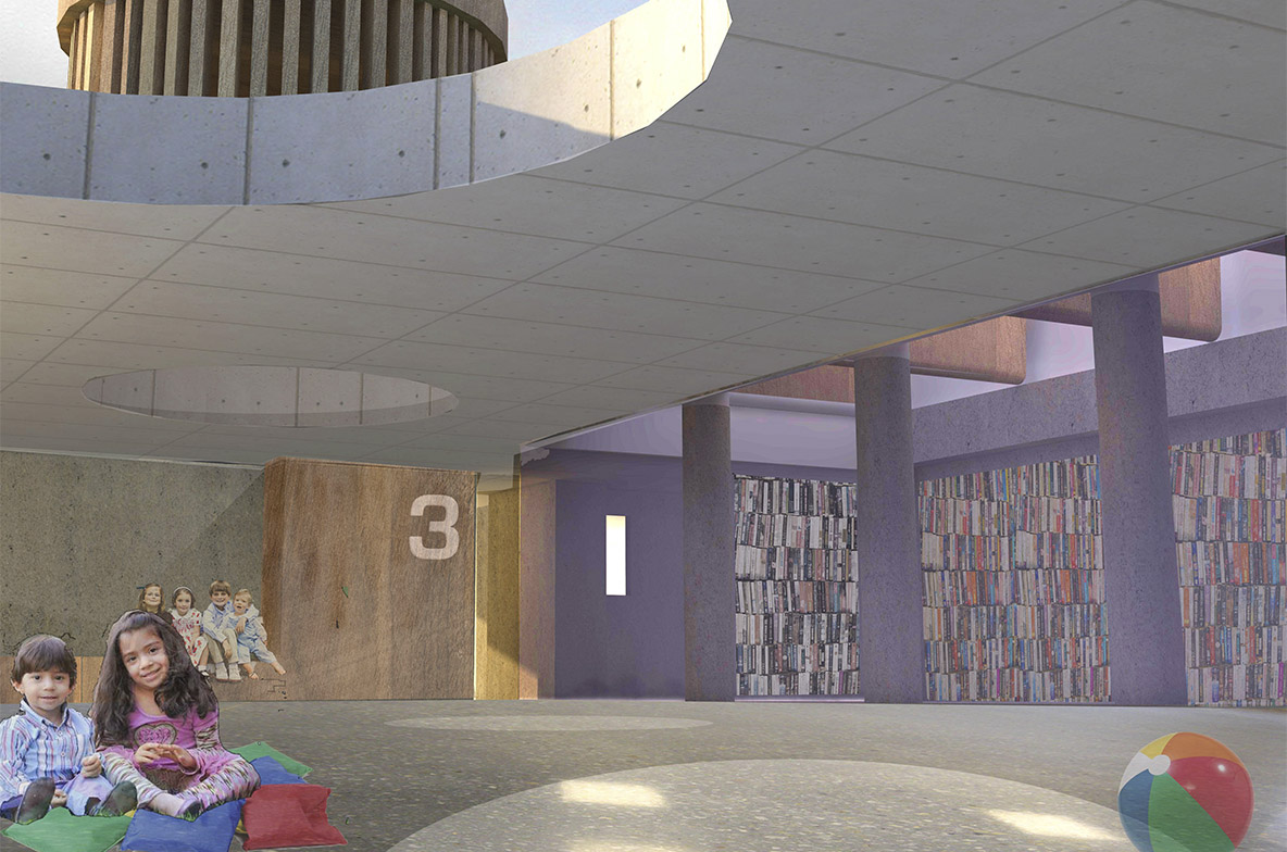
Entering the building from the bridge, the craft/bookshop leads directly off the entrance hall. The information desk and lift are directly opposite the entrance and the main stairs allows immediate access to the floors above and allows visitors to enjoy the main hall, which itself may be used to display work and provide a gathering place.
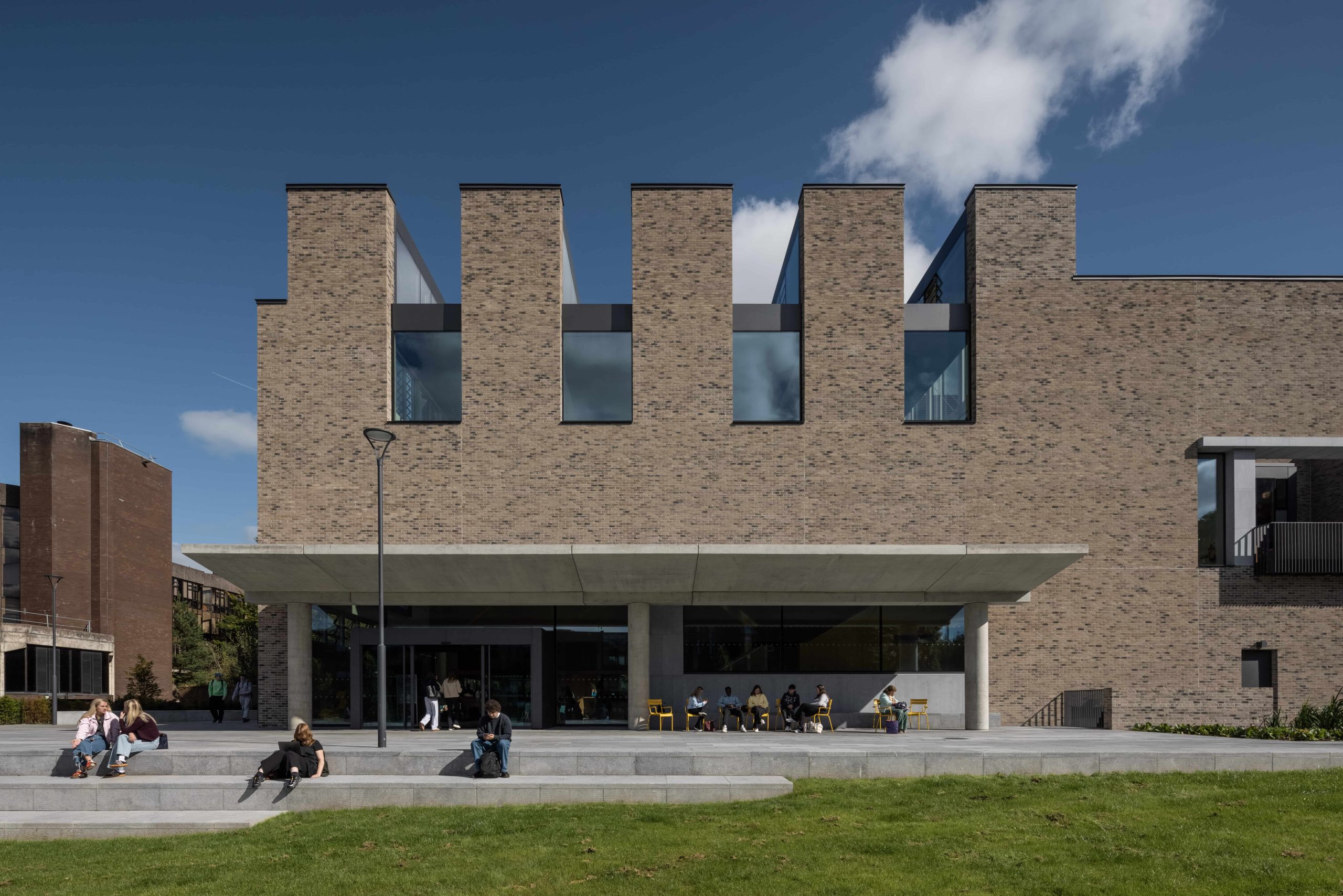
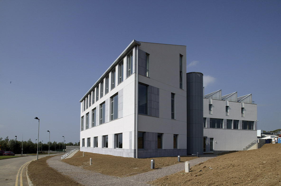
The galleries are simple spaces with maximum wall area, facilitated by the clerestorey windows providing constant northlight to the rear walls of the galleries. The galleries may be used together or separately.
On the first floor a viewing gallery wraps around the hall on the 3 sides, the south side being occupied by the workspace. This is a long room, the utility space with sinks and stores placed at one end. A continuous window with vertical louvres to deflect the midday and evening sun lights the space. This is at high level so that benches can be placed along this wall or walls used to display work in progress.
The artists studios are placed on the north side of the building with windows looking east or west.
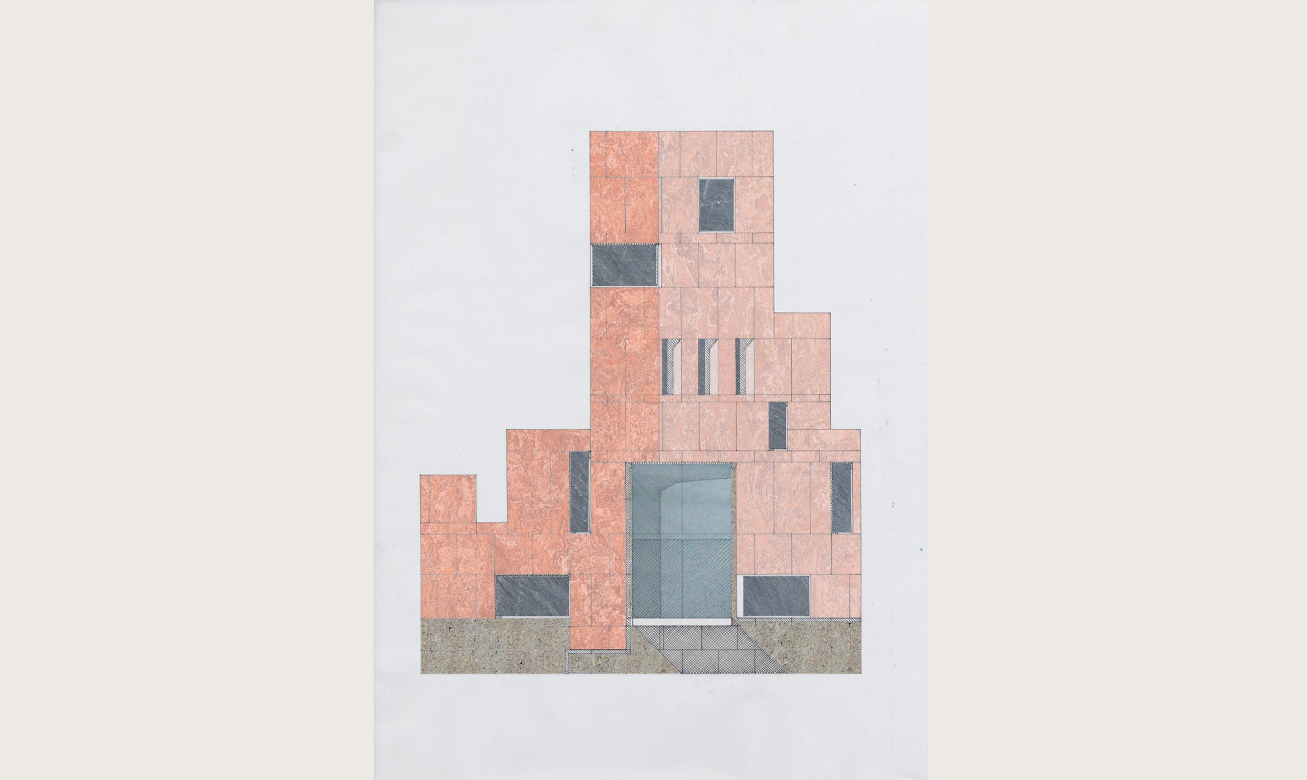
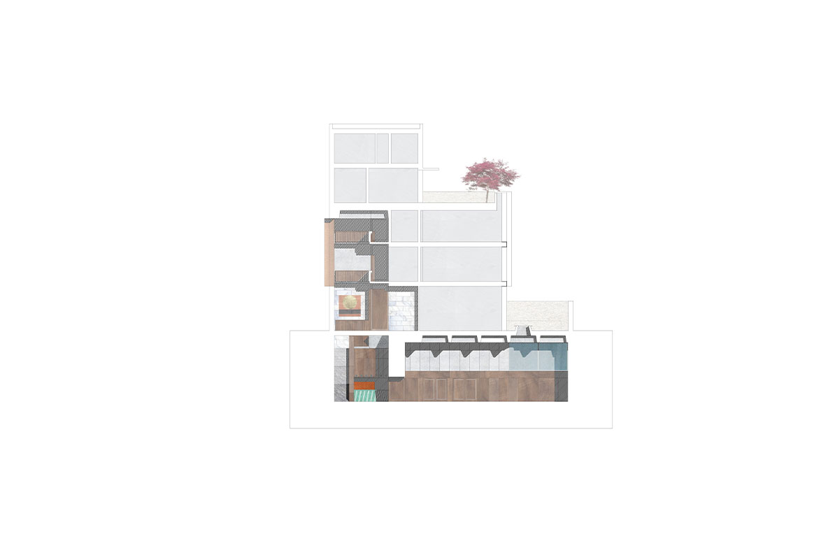
Moving up the building, the performance space is placed above the hall and is also a double height volume with a balcony to the side. This arrangement allows many options for use- rehearsal, performance or teaching. Storage, projection and technical spaces are concealed in the wedge-shaped spaces in the front wall. Dressing rooms and toilets are placed under the balcony. The performance space is essentially a black box, however a number of deepset windows at high level can provide dramatic daylight should the space be used during the day. There is also an external terrace looking south which will be used by the public during intervals or before performances. This will avoid the inevitable stampede for air and smoking at intervals! It is possible that a mobile refreshment stall could be set up by a local company to maximise use of this space.
The dance studio on the floor above is the optimum shape. High level windows with louvres are placed on 2 sides, leaving walls free for mirrors below. There is also a terrace at this level for staff use.
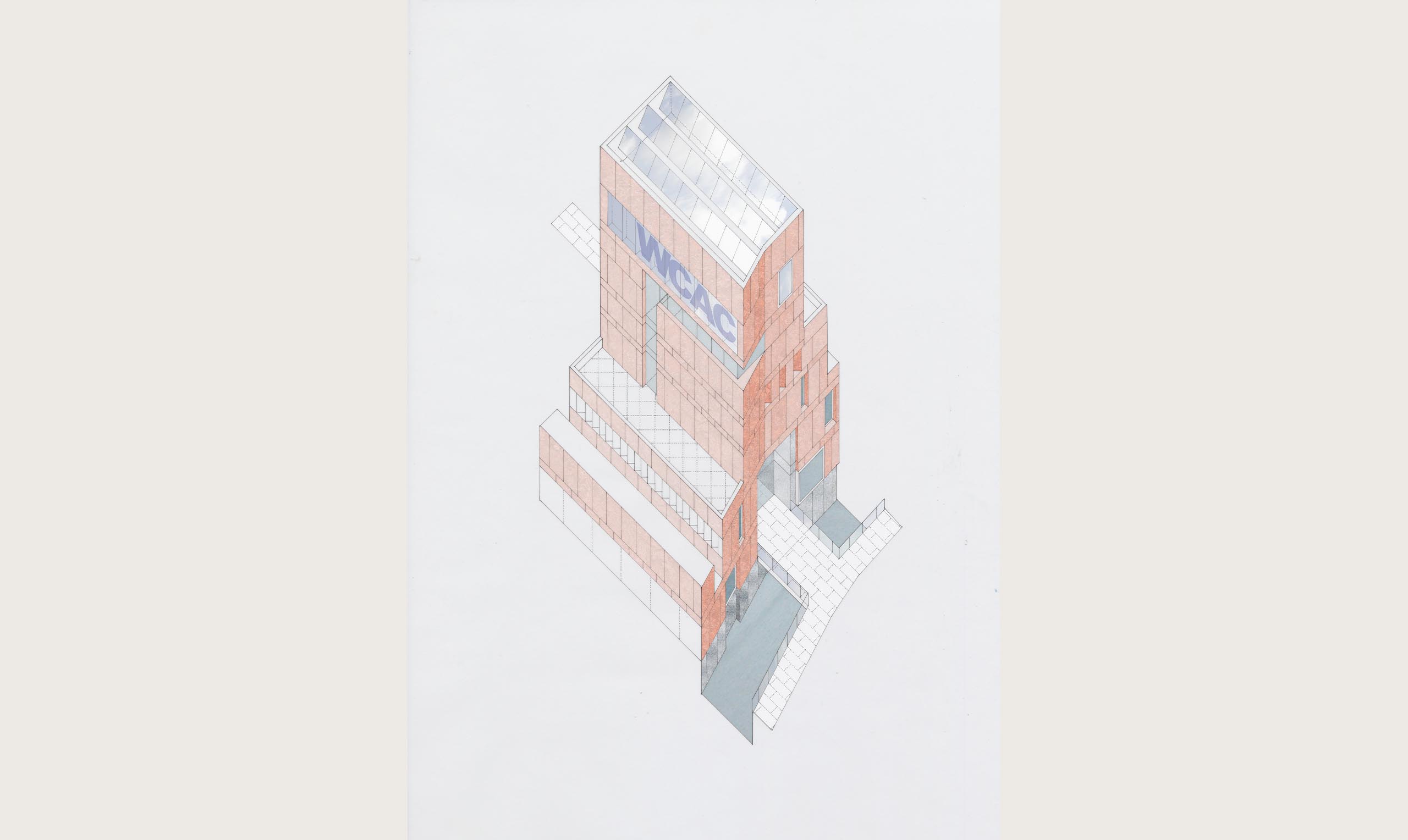
The administration and office areas are located on the top floor. Floor height glazing, shaded by screens, which become a supersized sign board, will provide light and views to the surrounding countryside. The floor plan is flexible; we have illustrated a combination of enclosed rooms and open plan space.
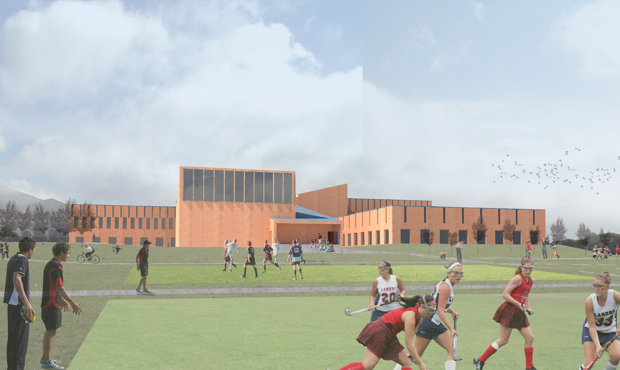
The use of the spaces may be reconfigured over time or following detailed consultation with the client and users. At this stage of the design we have endeavoured to make a coherent sequence of spaces and routes through the building. The centre should effectively facilitate the creativity of the users, yet be an iconic landmark appropriately scaled for Skibereen.
